


 What separates a great website from the mediocre masses? Speed, stability, and style definitely matter, but there’s much more to it than that.
Winning websites are portals for visitors to explore a new world, learn about a brand, and ultimately become a customer.
We talked with some web-savvy business leaders to hear their thoughts on what makes for a great website, and how their own sites set them apart from the crowd.
Instant Action
A beautiful, balanced website is a sight to behold, but it needs to inspire action as well. Great websites create a sense of urgency and inspiration for visitors – without being over-the-top or tacky in their techniques.
Think about some simple ways to get visitors more engaged with your page. A quick survey asking for their opinion? A free ebook offer in exchange for an email address? An interactive flash game that has them choose a favorite product?
Action takes many forms – the only unacceptable form of action is the absence thereof!
“The Call to Action (CTA) button is essential for converting potential customers into customers,” said Bill Glaser, CEO of Outstanding Foods. “It’s a tried-and-true marketing method that can easily boost your revenue, but so many sites hide their CTA buttons or neglect them entirely. Design an aesthetically pleasing CTA button that will stand out on your homepage, and include enough relevant information around it to let your potential customers know what they’ll gain from clicking the CTA button and what personal information they’ll be expected to provide.”
Easy Navigation
We’ve all been linked to a website that makes our jaws drop at first sight, but after a few minutes of scrolling and clicking around, we’re left scratching our heads. “What the heck do I do next?” you might have asked yourself.
The best sites remember to put functionality first, even if it means leaving some of those wild, abstract design ideas on the back burner.
Too much focus on novelty design and features may also take away from the fundamentals of a site like messaging and clear communication. These are things that cannot be ignored in a crowded online arena.
“When creating my websites, I make sure to keep my interface consistent throughout the site to ensure that the design is user-friendly,” said Elias Janetis, CEO and Founder of Squeeze. “The same goes for navigation because it won’t matter how beautiful my webpages are if none of my customers can find them. The biggest mistake I want to avoid while building my site is typos. It seems like an easy enough task to proofread a site and do it well, but you’d be surprised by how many websites have embarrassing grammatical and spelling errors sprinkled throughout their pages.”
There’s nothing wrong with some experimentation now and then if you have a passion for web design, but when it comes to capitalizing on your craft, simplicity is preferred.
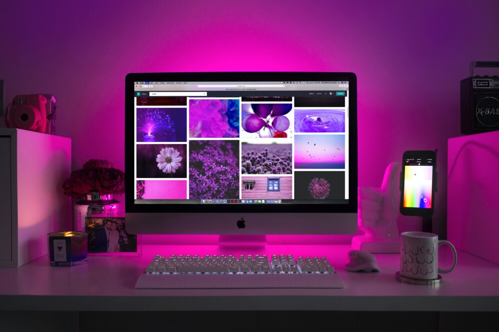
Awesome Images
 One or two images on the home page just aren’t enough these days. Websites that dominate the search engines are chock-full of bright, beautiful, professional-grade photos and graphics that capture the attention of the visitor and keep them coming back.
There isn’t a cut-and-paste strategy for image selection and arrangement, but simply including a ton of great shots can be hugely advantageous to a new brand.
“A featured image is important for SEO because it provides additional opportunities to include your keywords within your site’s metadata,” said Yuvi Alpert, Founder, Creative Director, and CEO of Noémie. “Incorporating alt-text, tags, and image titles with your keyword on a header will help boost your SEO while giving your site a stylish automatic thumbnail for any links to your site from LinkedIn or Facebook. Using a featured image will also make your site searchable on Google Images, which is where nearly a fifth of users conduct their online searches.”
The universality of search is just one more reason to prioritize multimedia assets and images.
Safe and Secure
There was a justified amount of skepticism about using the internet when it first came on the scene in the 90s, especially for early adopters of ecommerce. Who exactly is receiving my credit card information, and can they be trusted?
Now, the pendulum has swung in the other direction, and people are a bit too comfortable with shopping and interacting online. Security is still key, and brands should give it more attention.
“SSLs aren’t just important for your website—they’re a necessity,” said Dr. Tzur Gabi, Co-Founder of Caligenix. “There are plenty of computer safety add-ons and safeguards that won’t even let users navigate to websites without SSLs these days, and even if a potential reader is able to navigate to your site within their browser, sites without an SSL will have a hard time gaining their readers’ trust. It does impact your SEO within Google’s search engine ranking, it helps you satisfy your PCI/DSS requirements, and it’s basically the only way that your customers will be able to feel confident making a purchase on your site if you happen to be in the ecommerce space.”
Is it worth hiring consultants and security teams for extra protection? That’s for executives to decide after weighing risks and rewards.
Confusion-Free
We give a lot of credit to web designers for their ingenuity and ability, but they definitely get carried away sometimes. Some sites end up with too many features and prevent everyday people from making sense of it all.
Companies can take advantage of tests and quality control measures to make sure their sites are navigable and confusion-proof, no matter the experience level of the visitors.
“Website design should always be kept as simple as possible,” said Melissa South, SVP of SwingTie. “There are only a few instances when an over-the-top design should be taken into consideration. Most people just want to get onto your site, find what they are looking for, and move on to their next thing to do in their lives. You do not want them frustrated or confused, but rather happy with how easy it is to access things on your website. The easier it is to navigate for everyone the more sales you will see.”
Strong First Impression
We put a lot of effort into first impressions when reaching out to clients, attending job interviews, and any other pivotal moment in business life.
The same principles apply to your website, except the stakes are even higher! There might be hundreds, thousands, or even millions of people visiting each day, so make sure that first impression is powerful and impressive.
“Websites should be very simple, but contain a flashy feeling when you open them,” said Chris Gadek, Head of Growth at AdQuick. “Colors play a big factor in this idea. Make sure you have a color scheme that compliments your products and services. The colors of a website should be a major priority although it might sound odd. Think about it: when you open a website what is the first thing you notice? It will be the color whether you know it or not. The subconscious ideas that come with the colors will alter anyone’s impression of your company so make sure they are appropriate for what you are trying to accomplish.”
A Dash of Excitement
 When businesses first hit the internet, they could get away with doing the bare minimum. Skeleton sites were the norm, and little coding or foresight went into the process. Back then, just being online was good enough!
Now, websites need to include so much more. Multimedia is vital, and images and videos are now commonplace. It doesn’t take a ton of extra cash or time to pull off, and it’s worth every penny down the road
“There should be some sort of engagement on your website whether it be a quick way to contact someone or have videos that pull in engagement of visitors on your website,” said Jeffery Brown, President of Big Fig Mattress. “Extra forms of media on a website aside from text make a major difference in the experience offered by your website. You want people to enjoy visiting it so much that they will come back and find something else they want. Make it fun and engaging and people will want to come back.”
No need to reinvent the wheel here – there are so many viable templates for success, and it’s time to get up to speed.
Get the Message Across
Flashy visuals are fun to get people through the door, but strong messaging is what’s going to keep them around. Every website needs to make its mission clear right off the bat, so visitors know exactly what’s in store.
Think of it like the 30-second elevator pitch for everyone who could possibly visit your site. Give them the broad thesis, offer some real value, and direct people where to go based on their unique needs and desires.
“Your site visitors want to see a clear and concise headline and an informative sub-headline as well as an impressive featured image,” said Nik Sharma, CEO of Sharma Brands. “Informative yet simple headlines are important because users will likely click off as soon as things begin to look unclear and complicated so it is key to bring your pitch to the table immediately. As much as you want to be unique and stand out from other landing pages, customers usually don’t want to be sent down a rabbit hole of clicks that eventually navigates to the final stage. Keep it simple and straight-to-the-point and let what you offer do the talking that way you retain your site visitors and convert. The other key component of your landing page will be the featured image. Most people believe a picture is worth a thousand words so make your featured image engaging and inviting to complement your offer.”
Map Out the Journey
Click on any sitemap to see how modern websites are laid out in a logical, navigable way. Designers need to put themselves in the shoes of first-time visitors and simplify the journey for anyone who stops by.
“A well-designed website always includes clear navigation site visitors can easily figure out,” said Benjamin Smith, Founder of Disco. “Site visitors desire a smooth experience where you can quickly find the menu and navigation to specific pages. This is equally about structural design as it is clear messaging that won’t make your site visitors second guess how to do something on your site.”
Navigation isn’t just for first-timers, either. Returning customers, potential partners, and shareholders all need to find what they need as well, without delay.
Clean and Efficient Copy
 Many modern websites let images and graphics do most of the talking, and that’s great. However, without supporting text to clarify and amplify the message of a company, users might not fully understand a company’s mission or value proposition.
“A key element of website design is clear and straightforward organization and messaging,” said Tyler Forte, CEO & Co-Founder of Felix Homes. “When designing the page layout make sure to create separate tabs for all the categories you are looking to represent. Do not overcrowd the page! A good rule to follow is to never use more than 250 words per page. Customers are likely to get overwhelmed by the appearance of long text. Be strategic with your messaging and its placement. Highlight your key selling points and use simple and straightforward text. Do not disrupt the viewer with excessive imagery! Make the website as easy to use as possible.”
The perfect balance of visuals and copywriting will be different for every company. Brands need to decide on an ideal ratio and stick with it consistently throughout their site.
Amplify Communication
Long ago, websites did not offer much in the way of communication for customers or solicitors. At a minimum, early sites had a rudimentary contact page with a single phone number or address.
Now, companies need to offer multiple avenues of communication for users of all types, making the process super easy and straightforward no matter what their inquiry may be.
“An element of a well-designed ecommerce website is concise navigation,” said Ashwin Sokke, Co-Founder of WOW Skin Science. “The fewer navigation links you have, means the higher the probability you have of customers clicking on the links. Keep it simple but also appealing. Additionally, multiple channels of communication are important. Customers want to get in touch with you using different Toll-Free Numbers in different parts of your funnel and emails. Also, assign dedicated customer support agents for specific departments which handle various aspects of customer service.”
In other words, overcommunication is impossible in the digital age. As brands learn this lesson, their websites will offer users more ways to get in touch – and get what they want.
Consistent Branding and Design
Nowadays, branding begins online, and it needs to be 100% consistent across all channels of customer interaction. Color schemes, typeset, fonts, keywords – all those little components that make up a brand’s DNA need to be clearly defined and implemented throughout the site.
As companies spread their wings across social media and create networks of online allies, these branding fundamentals will be invaluable, so they must be hammered out ASAP.
“Well-designed websites should be inviting and thought and/or action provoking,” Roy Ferman, Founder & CEO of Seek Capital. “These effects can be accomplished by incorporating specific inspiring colors. Picking your brand’s colors should be considered carefully because colors are associated with particular moods or feelings. For example, a medical blog might incorporate the color blue into its design to invoke feelings of trust and reliability. A vegan food website might use the color green to harness clean, fresh energy.”
This doesn’t need to be a complicated process. In fact, simplicity is a company’s best friend when it comes to design and branding.
Performance is Key
The attention span of the general population these days isn’t just short – it’s basically non-existent. Web users have no time to spare when waiting for sites to load. If your site is slow, you might as well have no web presence at all.
A fast and dynamic site will outcompete a complex “work-of-art” website every time, and more brands are learning this lesson in real-time.
“The first lesson I learned about website design was to focus on optimization instead of a fancy design,” Brandon Monaghan, Co-Founder of Miracle Brand. “When you get too deep into the design aspects, you can lose sight of making the website easy and simple to use. I’ve seen many big venture-funded brands focusing a lot of capital and resources on intricate designs instead of optimization. Simple, elegant, and optimized is still the most powerful formula for success.”
If a company needs to strip away some features in favor of performance, so be it. The compromise is definitely worthwhile.
Minimize Clicks, Maximize Profit
Smart companies know that time is money, and that this principle applies to their customers as well as their own operations. Customers don’t have a second to waste as they research and make purchases, so the fewer clicks required to do the job, the better.
“Designers love subtle cues, because subtlety is one of the traits of sophisticated design,” said User Experience Consultant Steve Krug. “But web users are generally in such a hurry that they routinely miss subtle cues. It doesn’t matter how many times I have to click, as long as each click is a mindless, unambiguous choice.”
It’s time for brands to start thinking from a customer standpoint and make their sites more accessible than ever, even if that means dialing down the fancy design.
Make Life Easy for Users
Does your site require a computer science degree or UX certification to navigate and make a buy? That’s a sure sign it’s time to go back to the drawing board!
“Unless you’re running a secretive fashion brand or record label, there should be no confusion or mystery when it comes to understanding your website,” said Liz Eddy, Co-Founder & CEO of Lantern. “Simple, straightforward, and foolproof. That’s what you should be aiming for. Trim the fat and you’ll boost your chances for qualified leads and conversions.”
If you decide to one day launch your own high-concept website for your own amusement, that’s another story, but a brand’s primary goal is to cash in, and that means keeping it simple.
Inspire the Audience
Have you ever been to a website that just inspires you to discover more? It may be the images, the product showcases, or just the intuitive flow of the navigation. Before you know it, you’re loading up your cart and typing in your credit card info.
Some websites just have that magic ability to draw you into a new reality and convince you to buy with pure emotion and inspiration. That should be the goal.
“The best websites transport you to a different dimension where anything is possible,” said John Scheer, Co-Founder and Chief Creative Officer of Herman Scheer. “Our website uses bold imagery, confident copy, and real-life examples of our work to demonstrate that we’re a cut above the rest. Even if your business is just getting started, a strong website will raise the bar for everyone and attract a lot of positive attention.”
Quick and Efficient
Set a timer and go to your homepage. Walk yourself through a typical user experience from beginning to end. How much do you learn about the company and its products? How many opportunities are there to make purchases or engage with interactive features?
The lesson here: a website should accomplish a lot in a very short span of time. This goes for navigation, communication, and of course – messaging.
“Visitors to your website should be instantly informed about your value proposition and what makes your business unique,” said Derin Oyekan, Co-Founder of Reel Paper. “It shouldn’t take more than a few seconds to get the key points across to the users. Every moment is valuable, so the faster you can convey your mission, the better.”
Put the Product First
Great brands never forget the reason why people come to their site in the first place. The products are always the star of the show, and there should not be any distractions that take away from this main event.
If you’re hiding your products away in the back pages of your site, that communicates a lack of confidence in your offerings. Be bold and put them on full display!
“If your products are visually compelling and cool, put them front and center so that visitors don’t have to do any digging or link-jumping,” said Jason Wong, CEO & Founder of Doe Lashes. “We offer users the chance to add products to their cart on the very front page. You’d be surprised to see how many people are immediately compelled to make a purchase when they have the opportunity to do so.”
Remember, things move lightning fast online, and products sell quickly if you know how to position them upfront.
Roll Out the Welcome Mat
 The VIP treatment is something everybody dreams about, so why not give newcomers a warm welcome when they visit your site for the first time?
“Your website is the center of your digital ecosystem, like a brick-and-mortar location, the experience matters once a customer enters, just as much as the perception they have of you before they walk through the door,” said Author and Small Business Expert Leland Dieno.
This might mean an offer to save a chunk of cash on their first purchase (15% off, anyone?). It could also mean an invite to an exclusive list or the chance to win free stuff. The point is to make that first impression strong and memorable.
Engagement is Everything
What use is a website that offers nothing in the way of engagement? It might look nice and clean, but people want to interact directly and discover more.
Human beings are naturally curious and like to push buttons to see what happens. That’s just in our nature? Great sites use this to their advantage and offer many ways to interact.
“Give visitors a reason to stick around once they arrive at your webpage,” said Alex Keyan, CEO & Founder of GoPure Beauty. “Images and copy can do the trick, but today’s users need more if you want them to stay and learn about your products. We offer things like ingredients lists, quizzes, and interactive communities for people to get involved and familiarize themselves with our brand. It pays off in a big way.”
Besides, once users are comfortable interacting with a website, they are way more likely to pull the trigger on a purchase.
Minimize the Mess
We appreciate the minimal trend in modern web design since the alternative is a crazy mess of text, graphics, and features. Customers should feel like they have a choice when they visit your site, but not so much variety that they get overwhelmed and jump ship.
“Have you ever bailed on a website because it was just so cluttered and messy? Pages with too much content signal to the user that your business is trying way too hard and lacks identity,” said Aylon Steinhart, CEO and Founder of Eclipse Foods. “It’s better to keep things minimal in terms of design to showcase your mission and offerings.”
If you think your site is a bit cluttered, it probably is. Clean it up and offer a more pleasant user experience for all.
Showcase Some Stats
You’ve got to have some pride in your work and show that self-belief to the audience. A website will convey that confidence, not only through smart design and calls to action, but with testimonials, reviews, and statistics from real results.
“If your business offers professional services, show off those impressive stats and do a bit of humble bragging about your accomplishments,” said Darren Litt, CEO of MarketerHire. “This tells visitors that your company is confident in its abilities and sets a high bar for performance. As long as you don’t appear arrogant, this will work in your favor every time.”
Next-gen websites are looking fantastic so far, and hopefully, more brands will get on board with these trends as the competition heats up.